Right, I have decided to complete another edit of my film! I've been inspired by soo much by the work I've seen completed by people in the group. I might be here all night, but I think it's definitely going to be worth it..
HERE GOES!
Sunday 4 December 2011
Stresssssssssssssssing out!
I'm stressing out to the max! Really panicking about the presentation, I feel as though my animation and film and no where near as good as others on the course!
Hopefully next term I'll be able to learn some new things on the softwares!
Roll on next Friday 4pm...
On a lighter note, its nearly Christmas :)
Hopefully next term I'll be able to learn some new things on the softwares!
Roll on next Friday 4pm...
On a lighter note, its nearly Christmas :)
Wednesday 30 November 2011
Final Animation
I am not happy with the Version Three (final), I feel as if I have tried an idea which is slightly too complicated for the first time using the software. I understand now that I should have remained with a simpler idea- and concentrated on my After Effects skills. I am frustrated with my final result I have many changes which I would like act upon if I get the chance, however If I do not have the time to make another edit, I will take the lessons I have learnt from this module and take it forward with me to my next design project.
I feel that my earlier versions (one & two) were more successful than this final version. This is because It stuck to a specific style. This style used simple drawings and sketches which I then added onto background and used an photographic image to finish the animation. This simplistic style worked really well and was not too complicated for my first animation.
The things which I think work well were:
• The background, the glow I added on the brush tool on Photoshop, adds another dimension to the stars and lets them stand out. Also how the layers move together in the background. I used five different layers which each moved slightly differently; creating a space effect.
• The Gaussian Blur was used to experiment with composition and dimension, this was added to try and add depth of field to the animation. This worked well but If I was to complete another version I would try and play around with this more, using the space ship to dodge in between the planets.
• I changed the photographic image from the 'screaming guy' to an image of an eye. I think both of the photographic images visually stand out, and I think that I could have used either of them in both of the animation. I am happy with the eye, because it creates a relationship between the composition., and transitions really well into the space scene.
The main elements of the animation that I would like to change, would be the planets, as I have mentioned before- I was much happier when the planets appeared two-dimensional, because It generated an audience of younger children, whereas the final version seems to have lost its purpose.
This is something which I definitely want to reconsider, the axis which the planets rotate on isn't as accurate as I would like. It has given me much practice on After Effects and in DP2 hopefully I will be able to take what I have learnt and will not make the same mistakes as I have.
Wednesday 23 November 2011
Animation: Version One from Zoe Stroud on Vimeo.
Here is my first
version of the animation. I have not created an animation before, so I was
intrigued to get started. When I first saw the software I was a little bit
concerned that I would not be able to use it confidently. I have carried out
some experiments so I understood the basic elements; because I have done this I
am happy to be able to complete a second version.
For me, the space
theme works really well. However after seeing it as a completed piece, there
are some significant changes that I want to carry out. Although I really like
how all the different layers move for the background, I think the colour and
appearance could be improved. I am going to adjust the background so that it is
darker, I am going to experiment with the glow effect and the brush tool to
create some shapes that look like stars.
Although I think the
background and the photo image work well together, I want to try and make the
lines on the image smoother; currently they look quite rough. I am going to try
and create these images now on Adobe Illustrator. The pace of the animation is
a lot slower than I though it would be, I need to increase the speed so that
more can happen which will include the spaceship. I want to try and add even more layers and animmate the layers to move at different speeds.
Animation Insipration
This is just such a beautiful animtion, plus its from one of my favourite films!
Tuesday 15 November 2011
15:32
I have now completed the second version of my interaction project, I feel that it was important to do the second version so that I could make important improvements. I took the tutors feedback and changed it due to advice I was given. I am quite happy with this version, however I plan to gather some more feedback to try and to complete another version with more improvements.

My target audience is children aged between 6-9 year olds, I think that my project achieves the aim for this audience. The drawings/ sketches with I have used are basic, 2-D shapes which I believe appeals to children. The colours/fonts and language used have all been specifically picked so that they are 'child friendly'. I think that my project achieves its aim of being user friendly. I am happy with most of decisions I have made, and I am very glad I have been able to become used to the software, because now in my next project I will be able to create a more complex idea- maybe developing a game or an detective interaction piece.

The sketches and images which I have used were purposely drawn to be two dimensional so that they would look like cartoons. I found it quite tedious when I first encountered the HTML coding, but after an afternoon of playing around on the programme, I soon picked up the basic skills. My first edit was initially quite basic, but I added a second option in my second version, this enables the user to have more choice. If I complete another edit, I hope to change the links so that one option can only be chosen at a time.
Improvements that could be made include, changing the text so that it isn't as harsh, maybe changing the opacity on the black background. This will make it contribute to make in more user friendly. Another improvement that can be made would considering adding music, or sounds that when they are clicked on- they encourage the user to become more involved, this would be the next stage in the process and is a key development for my project.
Wednesday 9 November 2011
Feedback: Interaction
After
speaking with the tutor yesterday, I received some feedback on my interaction
project, version one. I knew myself that there was still more work that I
wanted to do to it, but I was not sure on what. I was given some constructive
feedback which I feel will help my project move forward.
Here are
the main points:
- Add another option from page three- this way the project will be more diverse and keep the children engaged
- The tutor mentioned she really like the colours and themes of my idea, and thought it generally worked well.
- I have to remember the target audience of children, so cannot use anything too graphic
- I was told to have the hotspots on the birds instead of words, as it makes it easier to navigate and it is what children would naturally want to click on.
- Add a bridge image of him flying home, to show how the time is moving and progressing
- On the page where it shows mushrooms & birds I was advised to take out the lettering and just have the images.
- Keep words simple like I have been doing eg. Mr Bird, Mr Fox.
I'm happy
with the feedback I received and I am going to make these changes over the next
few days, ready for the project to be completed. Also I plan to test my product
out on school children- aged between 6-7, this will help me a lot when evaluating
as I will have comments and reactions from the intended users.
Form vs Function
During our seminar yesterday with Jools, I found this interesting video on form vs function by Porshe. I think it introduces a new concept.. Thought I would share, take a look:)
Sunday 6 November 2011
Version One: Interaction Project.
I have completed my first version of my interactive project- I was surprised that I enjoyed learning about the HTML and CSS as much as I did when creating this project. I thought that I would find it difficult, after practising a few times I soon picked up how to navigate and use Adobe Dreamweaver.
My first version uses nine pages, which give the user option to select and navigate through the site. I think that the navigation is clearly labelled and is easy to move through the space without struggling to find where to click. The illustration and images I have used work better together than I first thought, and it has enabled me to expand my skills on drawing, photoshop and dreamweaver. In our seminar on Tues, I hope to gain feedback from the tutor to help me progress my project further. I want to add another section onto the project, guidance and feedback will help me to achieve this.


My first version uses nine pages, which give the user option to select and navigate through the site. I think that the navigation is clearly labelled and is easy to move through the space without struggling to find where to click. The illustration and images I have used work better together than I first thought, and it has enabled me to expand my skills on drawing, photoshop and dreamweaver. In our seminar on Tues, I hope to gain feedback from the tutor to help me progress my project further. I want to add another section onto the project, guidance and feedback will help me to achieve this.


Images for Interation Project


Above are the my selection of images that I am going to use for my piece. They were taken in the Lake District last year- I am very happy with the photos & feel as though they will combine well with some of the illustrations I plan to use.
Development Interaction Project
Idea Two: 'I'm like a bird'
I picked this idea because its quite diverse and enables me to use illustration & photos. The idea looks at decisions an animal would make, this instantly would appeal to the audience of children due to the interaction with animals.
The idea features an image of birds which the user is persuaded to click, the bird has to decided what to eat & there are options which give the correct and incorrect choices. The user interacts and choses and learns from the experience. The user is able to be transformed into the bird, visually seeing things from its point of view. I think this idea is more varied with the possibility with me being able to be creative.
I don't want piece to just show a random selection of images, I think its really important that the user experiences emotion, perception, action and cognition. It needs to explain something and also tell a message. I think that this is the strongest idea which is able to let me develop it in several different ways. Although I like the first idea, this is stronger. Idea two is the idea I have chosen to use for my interaction project.

Thursday 27 October 2011
Interaction Project..
We had our first seminar on the interactive side of the course today & was given our brief. For the next three weeks we'll be looking at ways to create an interactive three dimensional space on the web. I've brainstormed some ideas in my sketch pad, but to gain some more inspiration I have decided to look at some previous examples. In the seminar we looked at last years interactive groups work & also looked at some really successful websites which already have been used. I have realised that there is so much scope for designing these kinds of spaces, any idea can be used in such a way that can be expanded through development and planning.
Monday 24 October 2011
Rule of Thirds
After Jools' lecture last week, we were asked to create a short film showing our understanding of the rule of thirds. In mine I have used an image which I took last year and added how I think the Rule of Thirds applies to it. Photographers use this rule to help to compose the image, it is believed to be one of the most famous rules of photography.
The Rule of Thirds can be the basis for well framed shot. When you apply the grid onto the photo, you can see where the best place to frame the image, it helps to produce nicely balanced photos which are in proportion. If you place the point of interest of your image along the intesections or along the lines it composes the shot better, and creates an image which is naturally more aesthectically pleasing. In my video I have placed the tree trunk along the left side veritcal line, I have also used the top horizontal line as a gudidance for the top of the trees. By following this rule I think my image is composed better and is overall more attractive.
The Rule of Thirds can be the basis for well framed shot. When you apply the grid onto the photo, you can see where the best place to frame the image, it helps to produce nicely balanced photos which are in proportion. If you place the point of interest of your image along the intesections or along the lines it composes the shot better, and creates an image which is naturally more aesthectically pleasing. In my video I have placed the tree trunk along the left side veritcal line, I have also used the top horizontal line as a gudidance for the top of the trees. By following this rule I think my image is composed better and is overall more attractive.
Quick Evaluation of First Edit
I have just completed my first edit of 'Robbing' Hoody', it has taken my a couple of days to complete, but I am fairly pleased with the outcome. I only have a limited amount of knowledge using Adobe Premier Pro CS5 and for this edit I transferred this knowledge to try and create the best possible result. What I discovered straight away was that although we had been filming over two days, I still did not feel we had enough footage. Whilst filming I learnt that it definitely is not as easy as I first anticipated, it takes a lot of team wok, cooperation and commitment to complete. Some of the shots we got we really effective, such as the POV shots from Robin Hood, but I wish we had captured even more footage like this so I had more to play around with once it came to editing.
Also I found it fairly tedious to continuously adjust the camera and set it up so that it was level and also the white levels were correct, some of the shots we got when this was not completed as well as it could have been, stood out. Now that I have completed the first edit, I do feel that we should have worked harder for some of the shots and really pushed ourselves- as the results can be endless.
Once I had remembered the basics of editing I did enjoy watching the short film come together. I had some difficulties with the sound, I found that there were long periods of silence where the background noise was not prominent enough, I felt that I needed to do something about this as it wasn't achieving the mysterious effect that I wanted. I searched online for some copy-right free music and found a few tracks, I used several, one for a siren sound effect, another for church bells and the last one was eerie music, which I feel helps to create an atmosphere. Looking back now, I know I could have easily recorded the church bells and sirens ourselves, this is something which I will definitely bare in mind for the future. I do feel that by adding the different sounds I have enhanced my piece slightly.
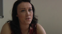
I was initially impressed with the footage I got from the interview scene of Zoe, however once looking back over it, I feel as though we should have definitely tried to have got better shots, with various angles. Also Deb pointed out that in some shots there was a grey notice board in it and that it diverts the eye from the actual important footage, this is something which I would reconsider shooting. It's small elements like this which can create the overall edit of the film to become and appear less professional.
One of the most obvious faults in the filming was underestimating the angle of the camera, I now know that it is very, very, very important to always ensure that the tripod is level. There is one particular shot in my edit which stands out dramatically because of the slight tilt, it makes the shot appear unprofessional. The same can be said about the light in some of the shots, this also needs to be carefully considered when filming next time.

I am really happy with the opening sequence, I felt that it was important to complete this sequence because it gives the audience on the setting. I editing into four establishing shots, which I feel all work very well together. I added in a video transition of a cross dissolve, which blends each image in really well. My personal favourite is the tram shot, it captures a sense of movement which I think is really effective.

I am generally pleased with my finished product, I think it depicts a good first edit. By creating this film I have learnt so much on the ethics of filming, so much more that what I already know. I am very happy with the storyline we chose as a group, I feel that it has a good structure to it and also uses the social and historical context of Nottingham. Hopefully I will get enough time this term to re-shoot and edit some of the footage once I have been able to develop my knowledge on Premier and that I have gained feedback from the group, friend, tutors and family. By gathering all that I have learnt together with feedback and new knowledge I am sure I will be able to create a knew improved edit.

Also I found it fairly tedious to continuously adjust the camera and set it up so that it was level and also the white levels were correct, some of the shots we got when this was not completed as well as it could have been, stood out. Now that I have completed the first edit, I do feel that we should have worked harder for some of the shots and really pushed ourselves- as the results can be endless.
Once I had remembered the basics of editing I did enjoy watching the short film come together. I had some difficulties with the sound, I found that there were long periods of silence where the background noise was not prominent enough, I felt that I needed to do something about this as it wasn't achieving the mysterious effect that I wanted. I searched online for some copy-right free music and found a few tracks, I used several, one for a siren sound effect, another for church bells and the last one was eerie music, which I feel helps to create an atmosphere. Looking back now, I know I could have easily recorded the church bells and sirens ourselves, this is something which I will definitely bare in mind for the future. I do feel that by adding the different sounds I have enhanced my piece slightly.
I was initially impressed with the footage I got from the interview scene of Zoe, however once looking back over it, I feel as though we should have definitely tried to have got better shots, with various angles. Also Deb pointed out that in some shots there was a grey notice board in it and that it diverts the eye from the actual important footage, this is something which I would reconsider shooting. It's small elements like this which can create the overall edit of the film to become and appear less professional.

One of the most obvious faults in the filming was underestimating the angle of the camera, I now know that it is very, very, very important to always ensure that the tripod is level. There is one particular shot in my edit which stands out dramatically because of the slight tilt, it makes the shot appear unprofessional. The same can be said about the light in some of the shots, this also needs to be carefully considered when filming next time.

I am really happy with the opening sequence, I felt that it was important to complete this sequence because it gives the audience on the setting. I editing into four establishing shots, which I feel all work very well together. I added in a video transition of a cross dissolve, which blends each image in really well. My personal favourite is the tram shot, it captures a sense of movement which I think is really effective.

I am generally pleased with my finished product, I think it depicts a good first edit. By creating this film I have learnt so much on the ethics of filming, so much more that what I already know. I am very happy with the storyline we chose as a group, I feel that it has a good structure to it and also uses the social and historical context of Nottingham. Hopefully I will get enough time this term to re-shoot and edit some of the footage once I have been able to develop my knowledge on Premier and that I have gained feedback from the group, friend, tutors and family. By gathering all that I have learnt together with feedback and new knowledge I am sure I will be able to create a knew improved edit.

First Edit of Robbin' Hoody
Here is my first edit of 'Robbin' Hoody', I hope to re-edit before the first term finishes so some feedback would be really great- good or bad :)
Filming..
This week has been really busy. Our group filmed Tues & Weds and we managed to complete by 4pm on Tues. I found that whilst on shoot it was a lot harder than first expected. I underestimated how difficult it was to adjust the camera to the natural lighting, and even by the smallest change of light (etc, the sun going behind the clouds) the shots were affected. Also I didn’t realise how every time the shot moved ,the tripod then had to be and readjusted to the ensure everything was level.
I got feedback from Deb today after I had completed my very rough first edit, she explained some things about sound and said that she would rather us to be enhancing and playing around with sounds that had been recorded than use a pre-recorded sound tracks. I have looked at some sound salready and downloaded a few tracks to experiment with. She also said how this edit was meant to demonstrate our learning process, so it was important to learn from what we had done, and what we could improve if we had the chance to refilm/re edit etc.
Friday 14 October 2011
Decision on Story
After the seminar yesterday with Phil, our group got together & decided on a treatment for our film. We all pitched our ideas within our group of four & decided on Jacks idea of 'Robbing Hoodie'. This idea uses a pun on the infamous Robin Hood a symbol of Nottingham. We pitched our idea to rest of the group- last night I drew up some storyboards & created a list of shots which we could use. This has helped me understand what needs to be done when it comes to filming next week..
I've sent an email to the equipment store for, ready for filming next week!
.. Watch this space..
I've sent an email to the equipment store for, ready for filming next week!
.. Watch this space..
Context 1: Designer essay
After the seminar with Jools on Tuesday I've decided on the designer which I am going to research & base my essay around. After some thought I have decided that I will be using Jonathon Ive- the apple designer infamous for his contribution the apple.
Editing Practice
After doing some filming practice last week in a small group, we uploaded the files onto the arnold server. The arnold server enables us all to have network space where we can store files for the whole group to access.
We shot some really basic footage, but it was a great starter task for everyone to get to know one another. Also it helped us to familiarise ourselves with the cameras, capturing various shots and angles. I discovered that it wasn't as easy as first anticipated, and was a lot different to the cameras I had used at ALevel.
Today we had an intro to Premier Pro CS4, I have used this programme before but only on a basic level. We learnt how to make cuts, add effects, manage the sound, add on transitions and render onto a specific file type. I made a short edit of the footage we had captured, I learnt that I needed to concentrate more on what is in the frame, when filming so that when it is loaded onto Premier the shot is framed better. I think that basically the more you practice & play around with the software, the more familiar you will become! I plan to head into Waverly over the week and try to get some practice done...
Untitled from Zoe Stroud on Vimeo.
Tuesday 4 October 2011
My Design Process
My most recent creative piece of work would be from my Art A Level course. Within the course we were set themes which we had to design and develop an idea to make a finished piece of art. As I had taken art throughout my years at school I understood what was expected of me in relation to the design process. I usually would begin my artistic development with research; I would start with one small idea and escalate it until I had several which all could be developed. I normally found the internet and books were the easiest way to find idea and artists who I could compare and contrast my work with. I always found that if I discovered an artist whose work motivated me, I could generally develop my own creative pieces much quicker and easier- pulling through the inspiration from that artist. Julie Baugnet is one of the artists which I found captivating and featured her work heavily in my research and development- see photo below (Serenade by Julie Baugnet).

The easiest way to test my ideas was to carry out feedback. I asked different questions and opinions from people who I worked with, family and friends. By having their input I was able to see which ideas worked better and which were more popular. Another way I would test out my various ideas was to develop each one further, so I could define which one I felt more comfortable designing and which ones generally worked better. By doing this I was able to distinguish which creative piece I wanted to pursue further and simultaneously constantly improving my work.
Generally, I do not often look at my previous work. But I understand that I am going to have to pull on my knowledge from previous practices, to help me move forward with the multimedia tasks that are set. After understanding that the Multimedia course at NTU is all about creativity, I now know I can use some of the techniques I have used in my Art course and translate them into various other Medias. Now I have thought about the processes I have carried out before, I am already starting to understand where these would fit into the course.
Monday 3 October 2011
Moving Image Research: Where's the Money Ronnie!
In the Design Practice 1 lecture, Deborah told us about a short film by Shane Meadows which features interviewing effects which are similar to the ones will we need to be using in our task. I am very familar with Shane Meadows work due to the fact I studied him as one of my case studies in my Media coursework. I always find his work fasinating as he manages to capture such a raw cultural message in most of his films, for exmple: 'This is England'.
The design brief which has been set us is:
Task - Design, produce and deliver a short 3 minute episode.
- Each student should research and develop and design two ideas to storyboard stage and
- pitch their ideas. Each student should document the process in their project file.
- Each group should decide on one idea to produce into 3 minute character interview, intercut with a flashback scene, that gives their account of what happened to the shoes.
- Each student should edit the footage ( individual edits) into a short 3 minute film and upload it to Vimeo.com.
- This film should also be embedded into your online journal with a 500 words that explains your edit decisions, highlights any problems you solved during the edit and explains how these problems could have been avoided, earlier in the process.
Another technique used well was the hand held camera shots, during the flashbacks scenes. Shane Meadows used these shots to tell the story from the point of view of each suspect. Using the hand held camera invites the audience to feel like an active member of the story, actively moving along with the footage as it reveals different elements of the plot. This is definitely an idea which I plan to use in my own film.
The strong dialogue which runs throughout of the film acts as a narrative telling the story. As an audience we can hear the interviewees anger and emotion building as they talk, creating tension and apprehension. I want to look at ways which I can feature this skill into my own work. I think the black and white colour scheme works well because it contributes to the 'purity' of the film. I plan to experiment with different types of colours schemes to see which one will enhance my piece- using both black and white, and colour could also create a really interesting effect.
Researching this short film has already helped me to understand my task- it has also given me knowledge on how to begin to organise my ideas. I plan to look at another existing interview style clip (possibly from the Bill, or something similar) to expand my understanding and knowledge further...
First Lecture..
So, we had our first lecture today with Deborah, introducing Design Practice One- at first I thought we had a lot of work to do in such a short period of time (which worried me). After getting my head around it all, I began looking at developing my ideas for the moving image task, which made me feel much better. I thought it might be best to get stuck in now, as we only have three weeks to complete, produce and edit a short film featuring interviewing techniques.
Having done an ALevel in media, I kind of understand the processes involved in developing and researching a media based project- however it seems to be much more in depth this time..
I plan to have a look at a few videos from You Tube and some various interview style clips to understand camera angles and techniques. I'll post these once I've done a little bit more research!
Induction Task: 2
For our second induction task we were asked to make a 10 second animation using only whiteboards, pens and a Canon stills camera. The group was divided into smaller groups where we all began to brain storm ideas. Our groups animation is the one which depicts the house and the box being transformed into lips and a strawberry. We wanted to keep the idea simple so kept with a basic idea.
We took 120 different photographs to create an animation of around 10 seconds! I have never done anything like this before, so I found it really interesting to see the final results. All of the groups animations were really good and some quite amusing! I thought this was a great starter activity and enabled me to get to know some of the group better :)
Thursday 29 September 2011
Multimedia Induction: Pin Hole Photography
As part of out starter activities and inductions to NTU multimedia, we experimented with pin hole photography. This was a completely new process for me, and I was interested to start the task. We made the cameras from a 500ml can, I was really impressed with my results. I took a quick photo of my image with my iPhone but i'll add more photos once they have been scanned in properly!
 I was so surprised by the detail that was captured through such a simple mechanism.. This photo was of the Arkwright building & you can clearly see the detail on the walls and the windows. :)

NTU Multimedia Graduate Review: Jason Hibbert
As I was browsing through the Alumni list of NTU graduates, I discovered a Multimedia designer called Jason Hibbert. Whilst looking through his work, I was impressed with the diverse range of media based work which he had in his portfolio. I was particularly interested in the Interactive pieces, which look to be created for Children to enhance learning and development.

The images display how Jason has worked strictly to a brief, to design an interactive piece which is functional and can be used for a specific purpose- in this case it has been created for the younger audience. I was initially impressed with the way that Jason Hibbert shows a range of various skills across the multimedia front. His works portrays his capability to adapt quickly to different design briefs and succeed in this.
The colour schemes, font size and style, language and theme, reflect Jasons ability to directly approach and target his audience. I am very impressed with all of Jasons work and I am looking forward to getting the course started to begin to learn new skills and understand the different technologies and how to use them.
Subscribe to:
Posts (Atom)